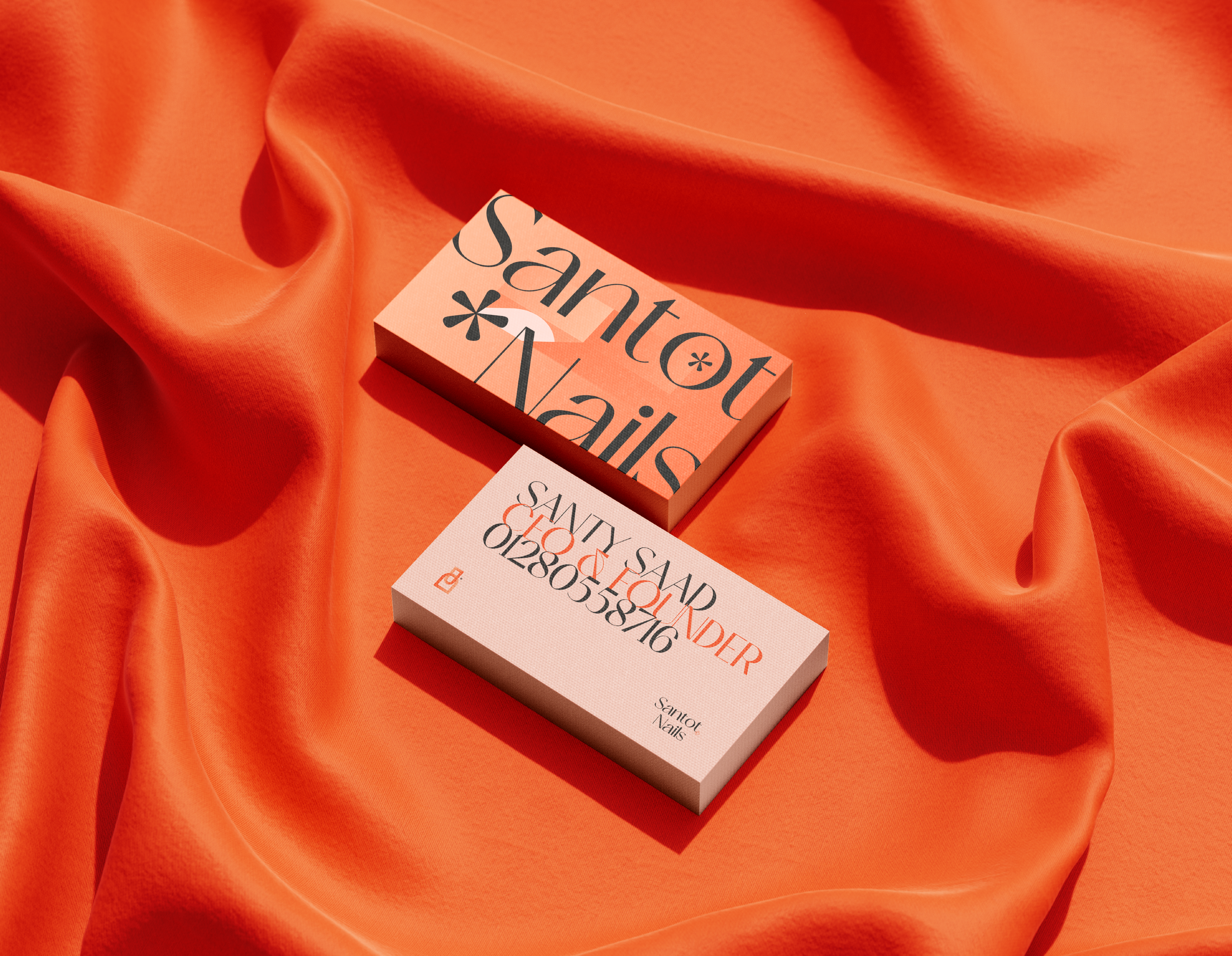
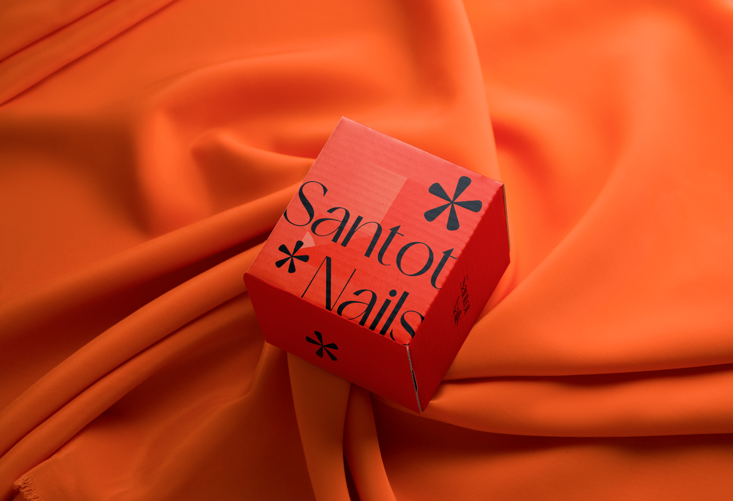
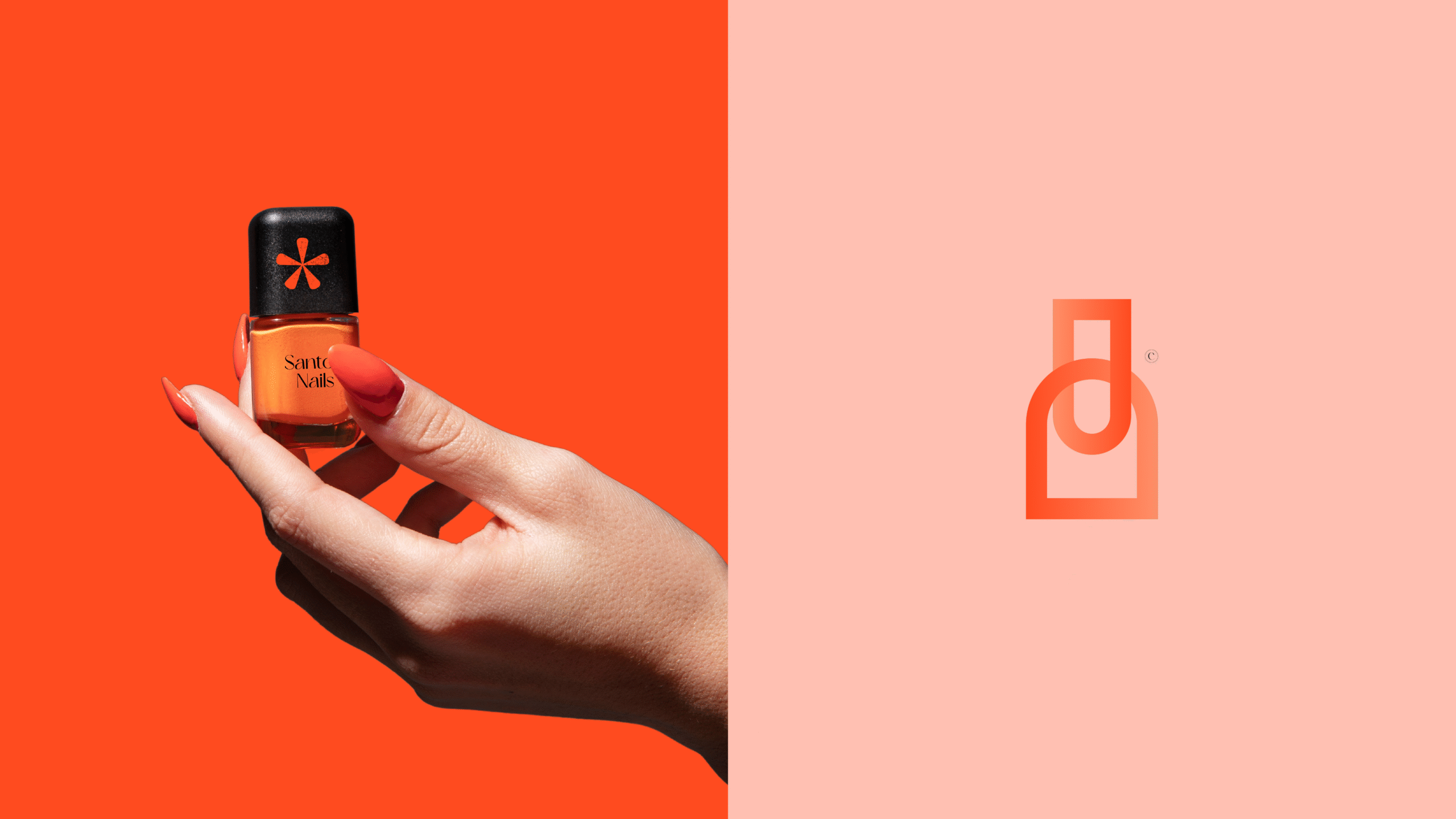
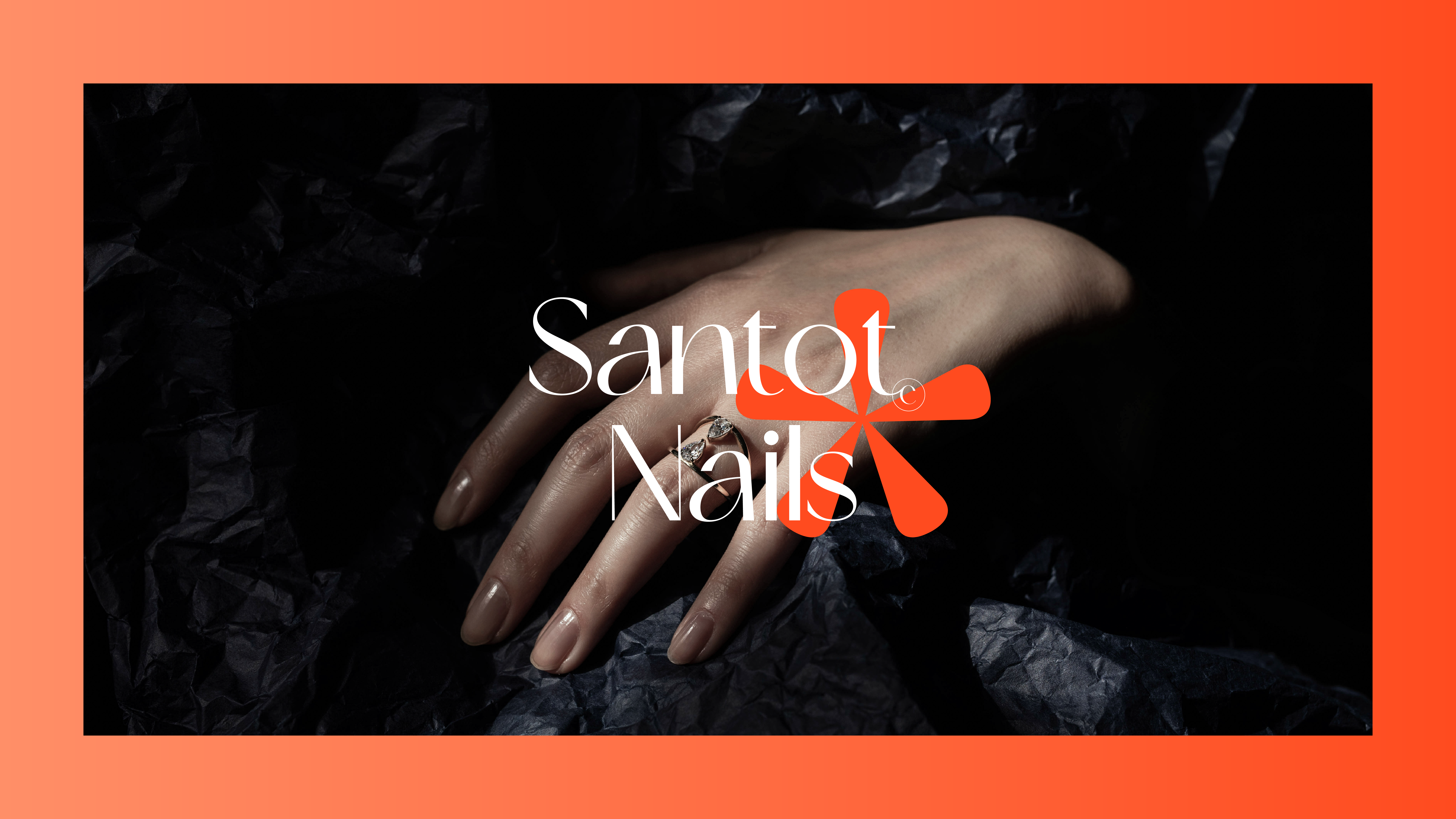
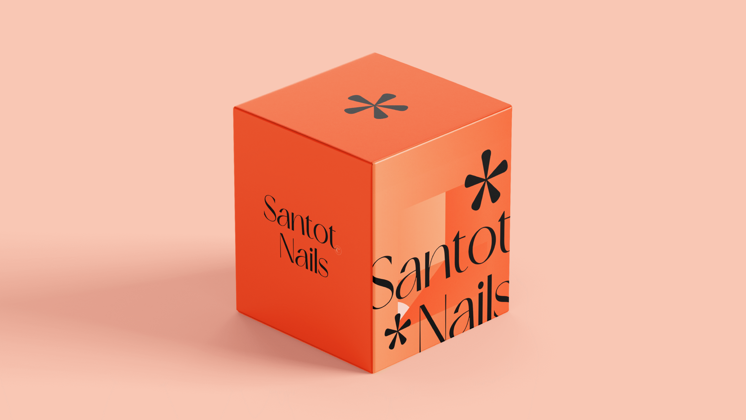
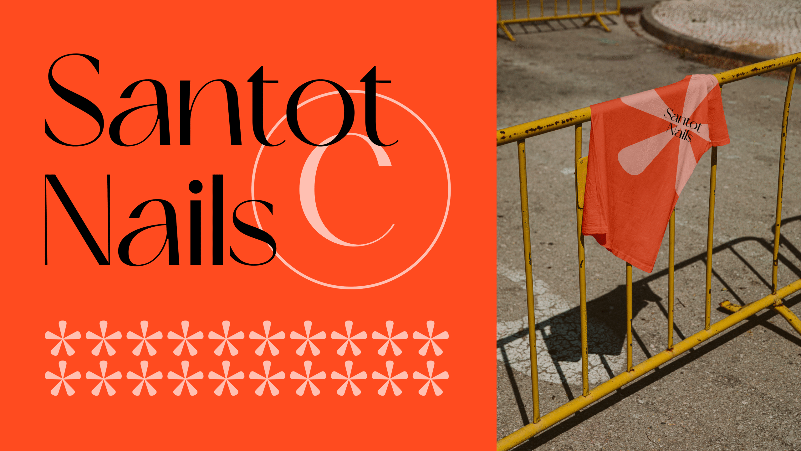
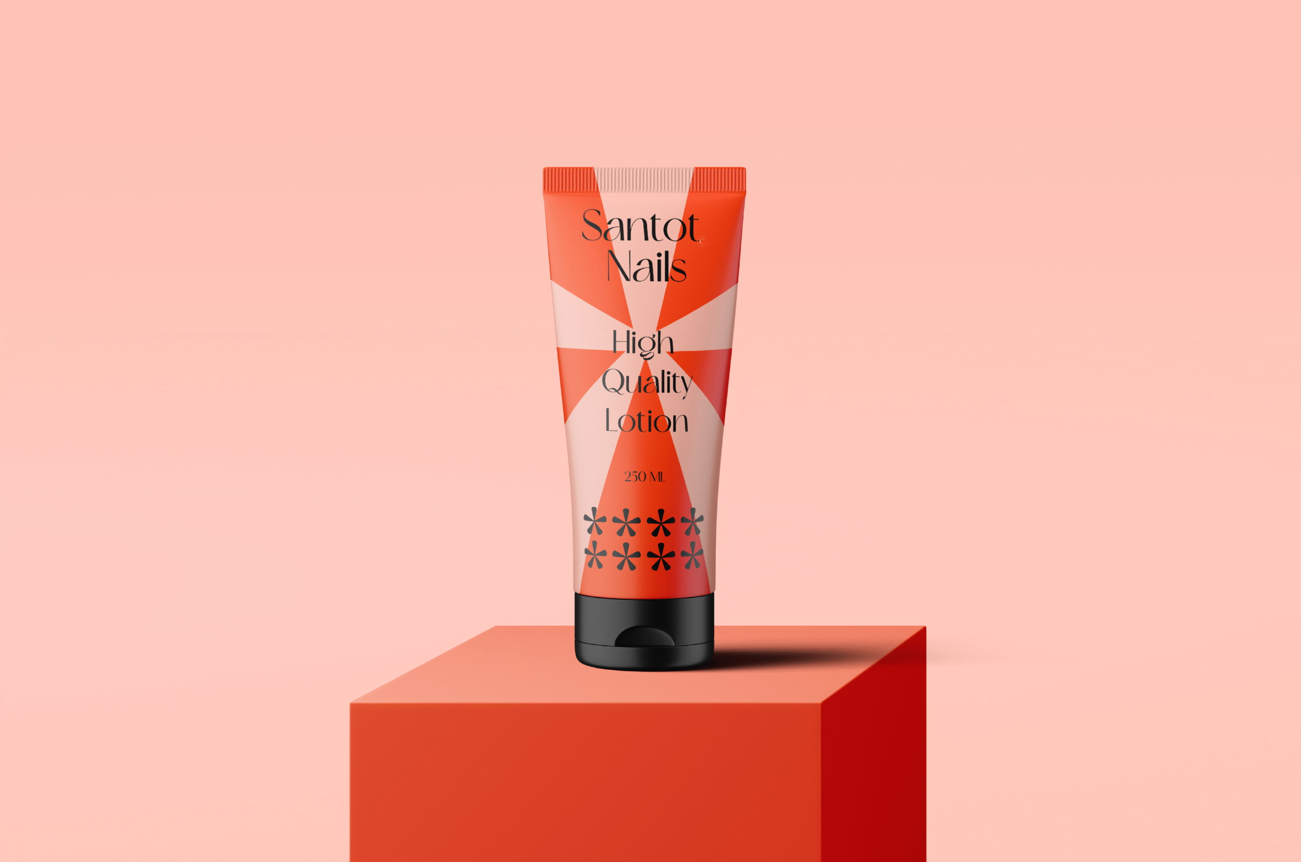
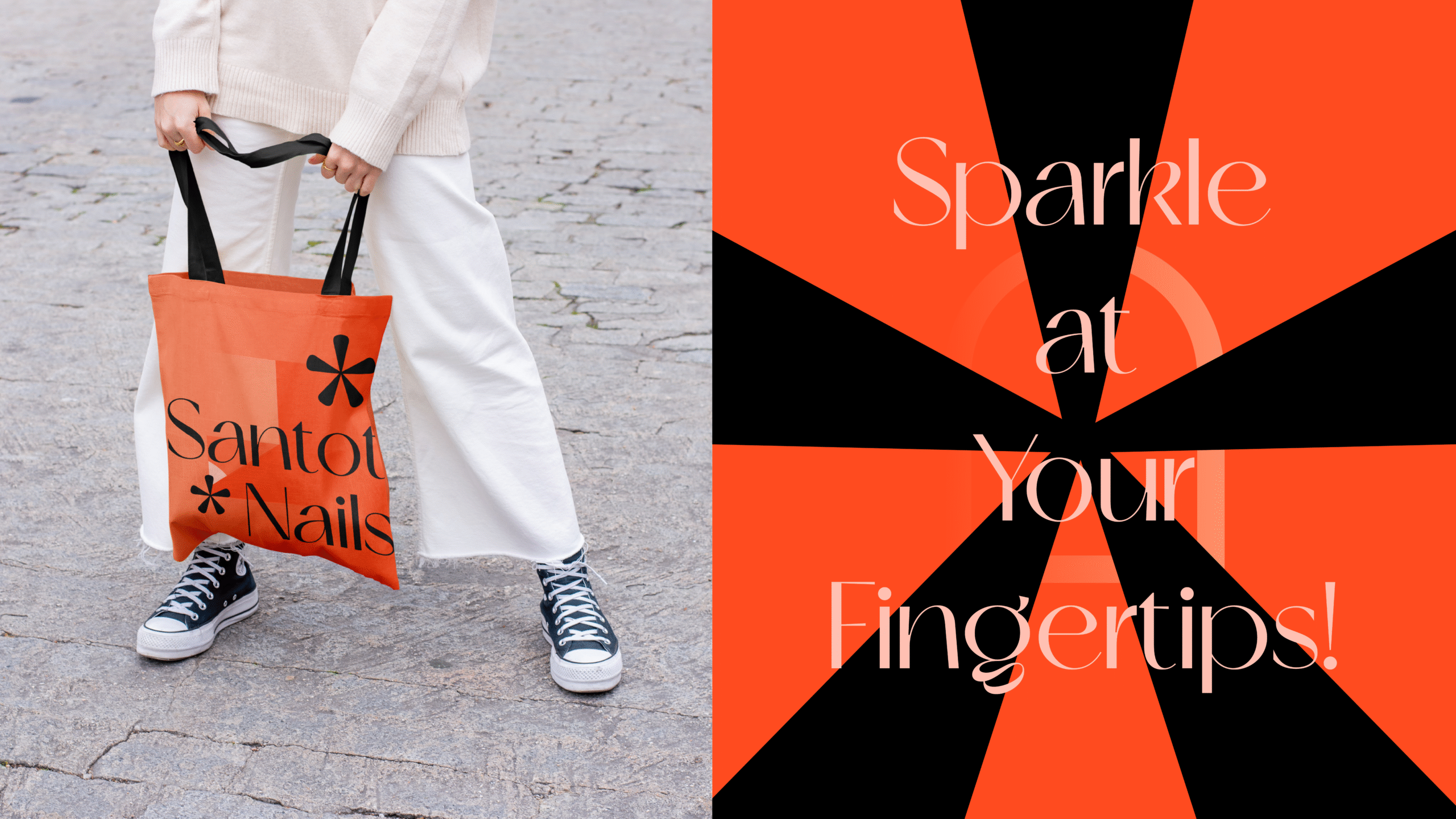
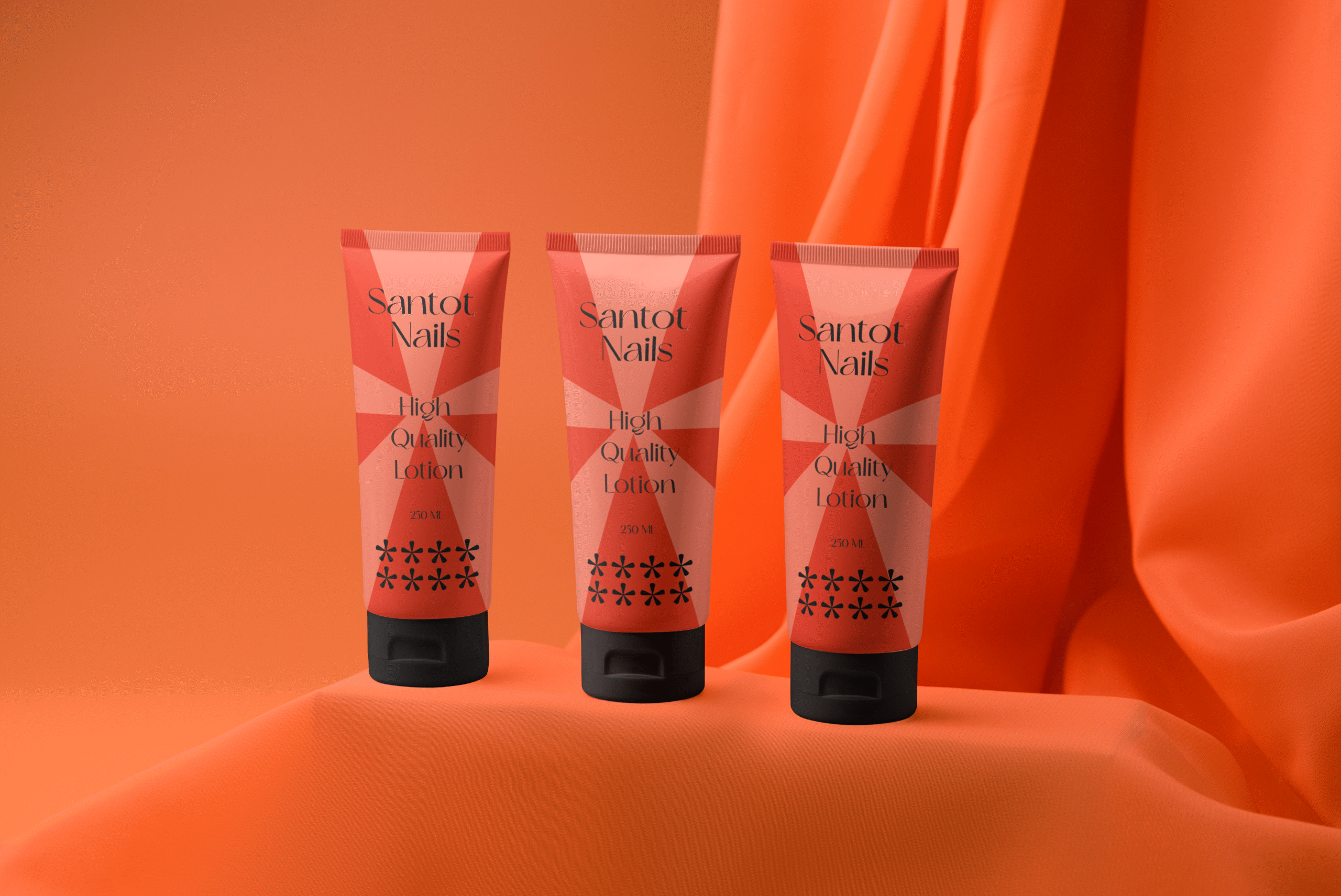
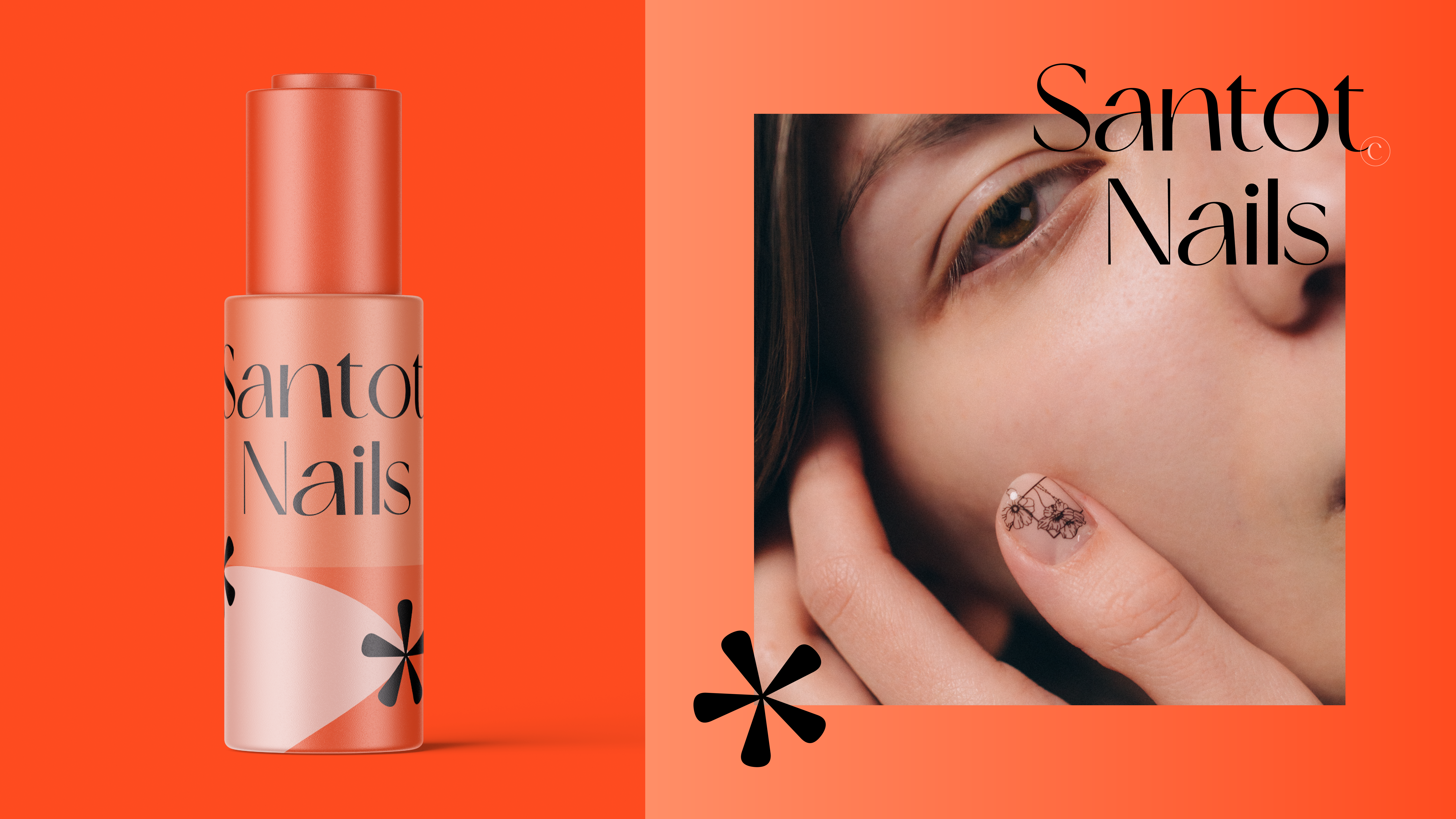
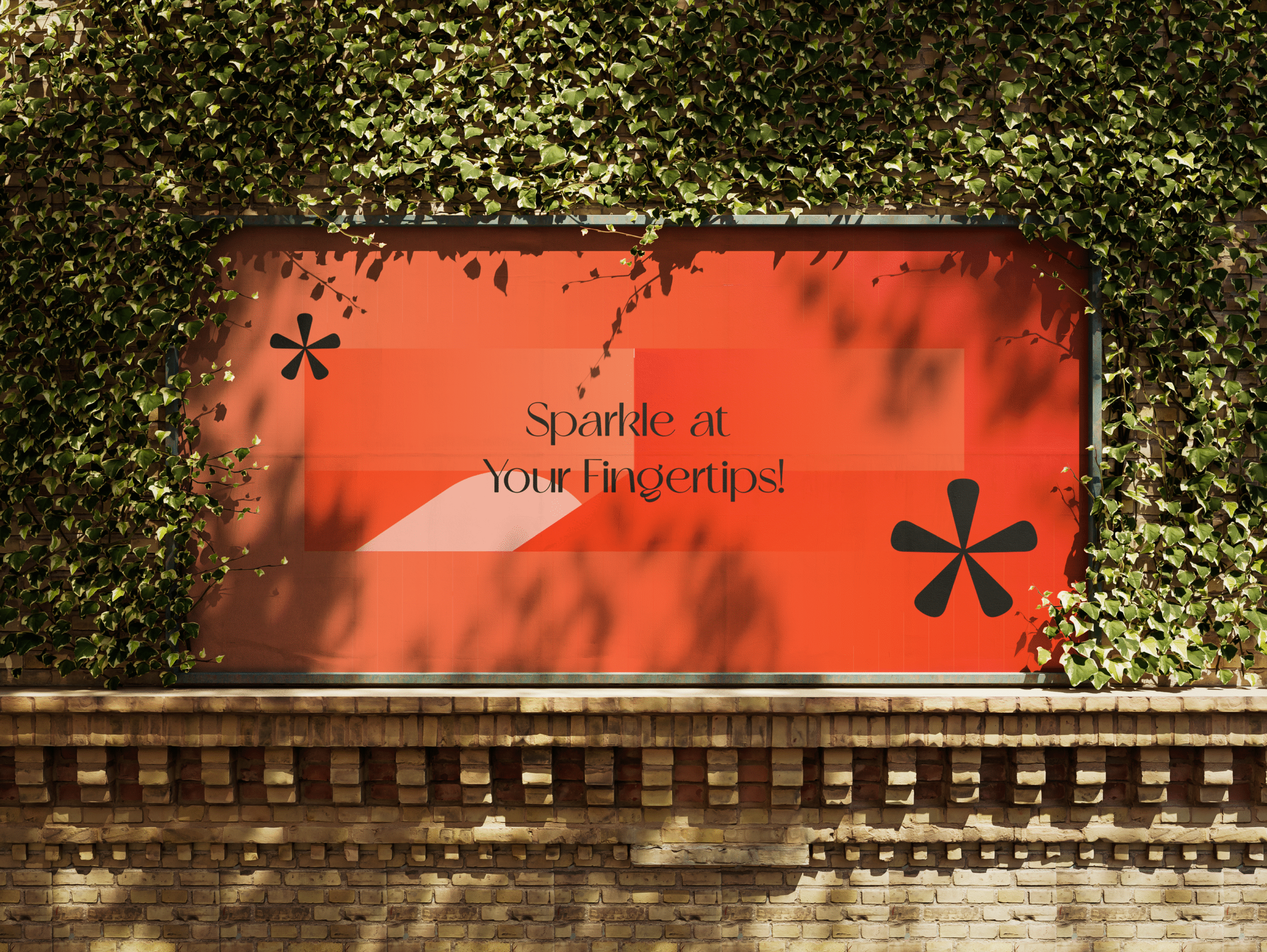
Santot Nails’ brand identity is a refined blend of warmth, sophistication, and modern femininity. Let’s break down the visual strategy behind the gradient orange palette and typography choices:
Orange
Symbolizes energy, creativity, and warmth. The gradient effect adds depth and movement, reflecting the vibrancy of nail artistry.
Black
Introduces contrast and sophistication. It anchors the palette, giving the brand a premium, high-end feel.
Light Orange
Softens the overall tone, adding a touch of approachability and femininity. It balances the boldness of the gradient and black.
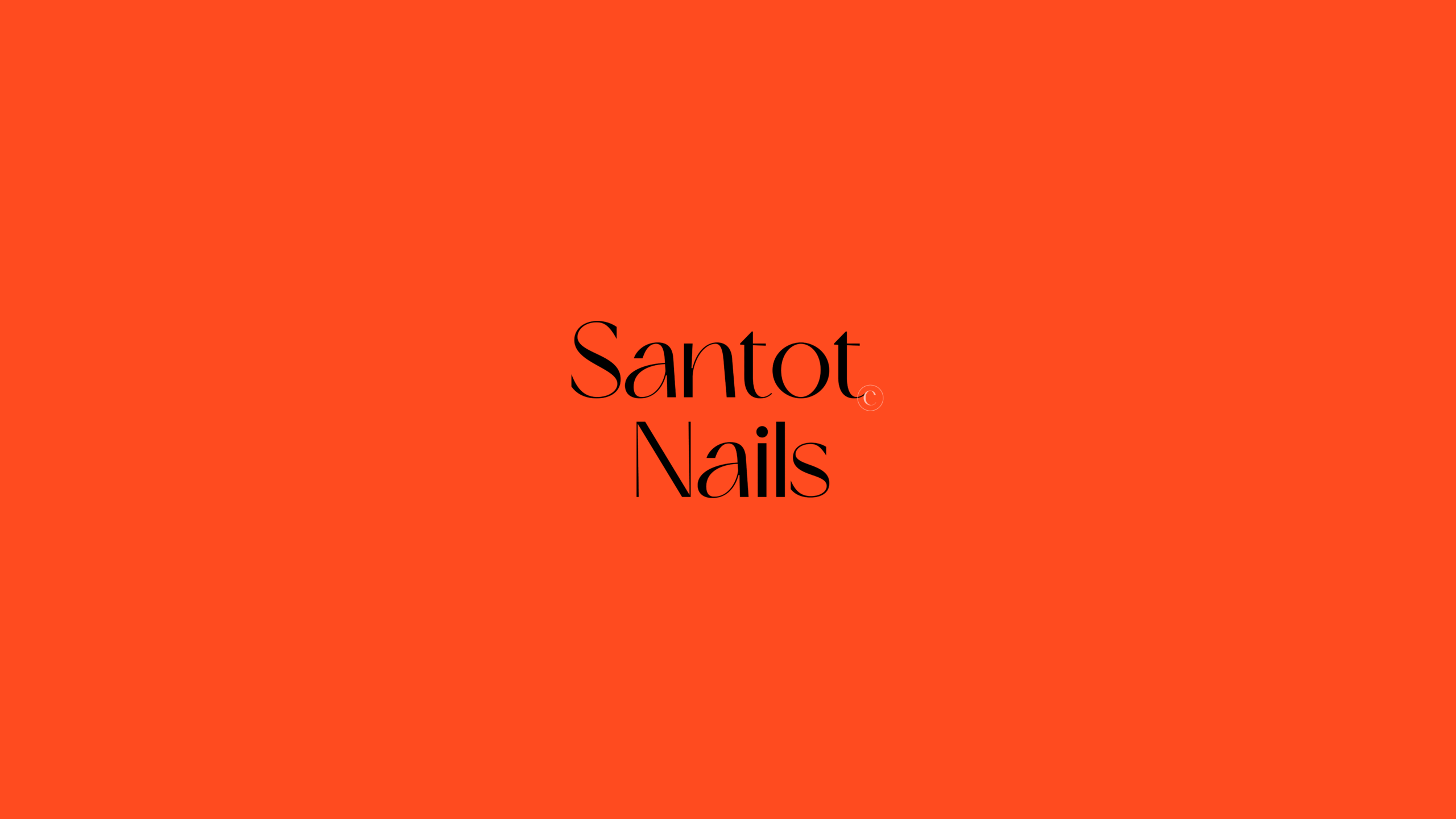
Typography
The simplicity ensures legibility and timelessness, while the elegance aligns with the brand’s upscale aesthetic.